Less is More Masking
Posted: March 18, 2012 Filed under: CAS, Darkroom Door, Penny Black, Wildflowers Vol 2 33 CommentsThe challenge at the Less is More blog this week is to use masking. Well that is not a challenge at all; it is more of a challenge not to!
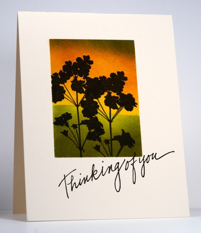
I masked the rectangular panel first and then positioned a second mask across the panel to make the hilly horizon. Above the horizon I sponged sunrise colours and below the grassy colours. After removing the hill mask I added the flowers from Darkroom Door, removed all the masks and finally added the sentiment from Penny Black. I like the way this sentiment looks like a hastily handwritten note.
Have a great day; I hope the sun is shining where you are!
Supplies:
Stamps: Wildflowers Vol 2 (Darkroom Door), Thinking of You (PB)
Inks: Summer Sun, Pumpkin Pie, True Thyme, Old Olive, Buckaroo Blue (SU), Versafine Onyx Black
Cardstock: Flourishes Classic Ivory


I can’t see the photo of your card for some reason but the blog thumbnail on SimplyLessIsMore looks gorgeous
Kathyk
Yes, the placement of the sentiment is perfect, Heather. On another note, I am feeling a little guilty. I cased a technique of yours this week for a challenge on splitcoaststampers ang have received beau coup accolades. Even though I gave you credit, I feel odd about it. Sorry.
Such gorgeous depth of color! Well done~
Beautiful as always. Love the sentiment you used. Can you give me the details about this sentiment I would like to buy it. Thanks Jen
Hi Heather, your card has so much warmth and character … so very lovely!
beautiful Heather!
Fabulous – like you I love the way the sentiment looks handwritten
Fabulous sunset scene Heather, …yes I agree about the sentiment too 🙂 Viv xx
Heather – Your work is always inspiring and beautiful. What is your secret to getting your masking straight?
Missy
Love the intensity of the colours and that sentiment – who is PB?
H heather
This is just up your street…. So easypeasy for you …. Fabulous card ….
Hugs Sylvie xxxxx
I always love your cards. fab card as always.
Great card – love your colouring! It really stood out in the thumbnails!
Stunning
WOW!!! Wow!!!
Beautiful landscape makes a fab card.
great card Heather! I love it!
As stunning as ever Heather!
Thanks so much
Chrissie
“Less is More”
Heather I just love how you have placed the sentiment for this at a jaunty angle!
So gorgeous again Heather. The colors and the depth of this card. Beautiful.
Lovely greet
Marja
Walk in the park for you Heather!
Sensational as always
Thank you very much
mandi
“Less is More”
Hmmmm, I wonder if these gorgeous cards you do really are a “walk in the park” for you or anyone else. Seems like a TON of work to get that color so saturated and shaded and without any streaks or gunky look like I get when I sponge.
Jean Cross cracked me up. I CASE your cards EVERY day but never have to “worry” that posting one in my Gallery would reap applause. if that day ever arrives, I would consider it a miracle. But I sure have fun trying.
Thanks for sharing!
Stunning Heather
Margaret x
Well yes, they did rather set that challenge with you in mind, didn’t they? It doesn’t matter, as you’ve created another beauty here. I really like the vibrant colours backing the silhouette.
Did the fog finally burn off in Ottawa? We had a warm, mostly sunny day here, with predictions of 24 (!!!) for Tuesday and Wednesday. Bring it on, I say!
Your masked creations are always a delight to see Heather and I’ve been waiting for yours to appear in this week’s gallery! I agree about the sentiment – I always like sentiments that look handwritten – and what beautiful colours you’ve chosen to showcase your silhouetted plants against.
Very striking, love the sentiment, Caggy x
Heather I love the silhouette design against the blended colors. Gorgeous!
absolutly stunning!
Gorgeous colours, so beautiful. x
A very striking card, love the dramatic silhouette image.
What incredible stunning colour! I love this card!
Beautiful colours and a wonderful silhouette image. Love the “handwritten” style sentiment .
Sylvia x
What a wonderfully dramatic effect you’ve achieved with the silhouette against these glowing colours Heather!